Build Better Online Training Courses By Taking Up This Challenge |  |
| Build Better Online Training Courses By Taking Up This Challenge Posted: 22 Oct 2013 12:44 AM PDT
A lot of teaching and elearning focuses on sharing information and pushing it out. Sure, that's part of what's required. But learning is more than acquisition of information. Learning involves processing the information and applying it. Then seeing what happens and making adjustments. So when building your online courses, consider how the learner can apply what's being shared. But let's shift the focus to our own development. What do we do to develop our own skills? How do we learn new things? Today I'd like to offer a simple way to help you improve your skills. A Simple Way to Develop Your SkillsFor the past few weeks, David's been running small challenge activities to help people practice their skills. We try to keep the challenges simple and short enough so that they're something you can do without a big time commitment. The objective of the challenge isn't to build the fanciest demo or module. Although, it is a great way to show off your skills. Instead the goal is to learn new techniques and practice using the tools. It's also a way to inspire ideas and help others think through their own projects. Here are a couple of things I learned from the recent challenges:
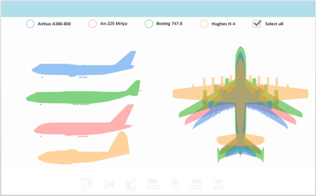
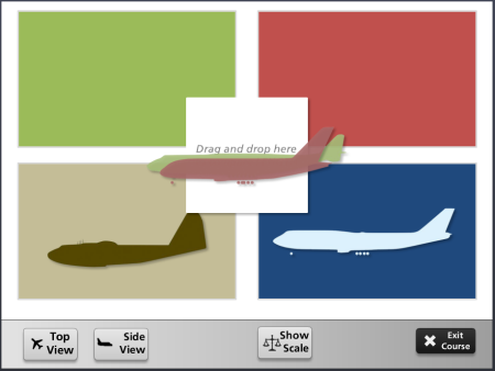
Below are a few examples from a couple of recent challenges. One was on how to create some comparisons between images. And the other was on creating a tabs interaction. E-Learning Challenge: Show Meaningful Comparisons
The objective of this challenge was to compare one object to another. David used this airplane graphic from Wikipedia as the starting asset. Here are some of the submissions from the community: Click here to view the elearning example.
Click here to view the elearning example.
Click here to view the elearning example.
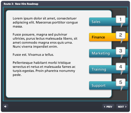
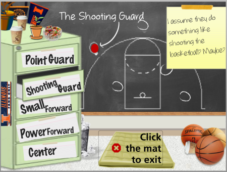
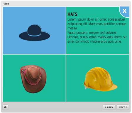
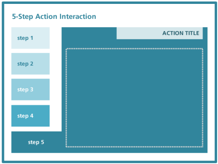
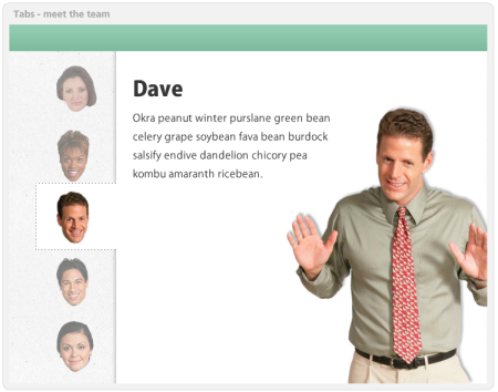
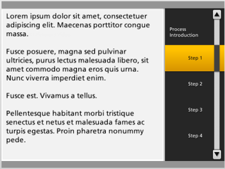
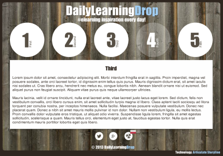
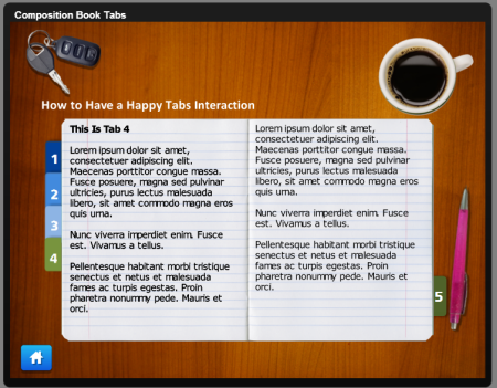
What I love about these demos is that each is a bit different. It shows that there's not a single approach for most problems. Can you imagine the results if they teamed together and had more time? E-Learning Challenge: Create a Tabs InteractionIn a recent post I shared a number of free PowerPoint elearning templates to download. They were different types of tabs interactions which are common to many online training courses. David used that post as inspiration to practice building your own tabs interaction. Below are some of the demos. You can click here for more details on the weekly elearning challenge. Click here to view the elearning example.
Click here to view the elearning example.
Click here to view the elearning example.
Click here to view the elearning example.
Click here to view the elearning example.
Click here to view the elearning example.
Click here to view the elearning example.
Click here to view the elearning example.
I love seeing what other people create and how they do it. I also find that when I review these demos they prompt my own ideas on how I'd approach the same thing. Sometimes it's easier to learn when deconstructing someone else's work than it is to start your own. Like any profession, building expertise requires practice. These weekly challenges are a great way to connect with the elearning community and a great way to practice building your skills. Are you ready to take up the challenge?If you want to learn to build better courses, connect with the elearning community, or practice using your authoring tools, then take up the challenge. It's not too late. These challenges are fun and simple enough to do. And you don't need to worry about things being perfect. They're just quick hit prototypes. This week's challenge is creating an elearning template based on a single clip art style. |
| You are subscribed to email updates from The Rapid eLearning Blog To stop receiving these emails, you may unsubscribe now. | Email delivery powered by Google |
| Google Inc., 20 West Kinzie, Chicago IL USA 60610 | |
--
Posted By tremeex to tremeex at 10/22/2013 07:44:00 AM
--
Posted By tremeex to tremeex at 10/22/2013 07:44:00 AM
--
Posted By tremeex to tremeex at 10/22/2013 07:44:00 AM
--
Posted By tremeex to tremeex at 10/22/2013 07:44:00 AM
--
Posted By tremeex to tremeex at 10/22/2013 07:44:00 AM
--
Posted By tremeex to tremeex at 10/22/2013 07:44:00 AM
--
Posted By tremeex to tremeex at 10/22/2013 07:44:00 AM
--
Posted By tremeex to tremeex at 10/22/2013 07:44:00 AM
--
Posted By tremeex to tremeex at 10/22/2013 07:44:00 AM
--
Posted By tremeex to tremeex at 10/22/2013 07:44:00 AM
--
Posted By tremeex to tremeex at 10/22/2013 07:44:00 AM
--
Posted By tremeex to tremeex at 10/22/2013 07:44:00 AM
--
Posted By tremeex to tremeex at 10/22/2013 07:44:00 AM
--
Posted By tremeex to tremeex at 10/22/2013 07:44:00 AM
--
Posted By tremeex to tremeex at 10/22/2013 07:44:00 AM
--
Posted By tremeex to tremeex at 10/22/2013 07:44:00 AM
--
Posted By tremeex to tremeex at 10/22/2013 07:44:00 AM
--
Posted By tremeex to tremeex at 10/22/2013 07:45:00 AM
--
Posted By tremeex to tremeex at 10/22/2013 07:45:00 AM
--
Posted By tremeex to tremeex at 10/22/2013 07:45:00 AM
--
Posted By tremeex to tremeex at 10/22/2013 07:45:00 AM
--
Posted By tremeex to tremeex at 10/22/2013 07:45:00 AM
--
Posted By tremeex to tremeex at 10/22/2013 07:45:00 AM
--
Posted By tremeex to tremeex at 10/22/2013 07:45:00 AM
--
Posted By tremeex to tremeex at 10/22/2013 07:45:00 AM
--
Posted By tremeex to tremeex at 10/22/2013 07:45:00 AM
--
Posted By tremeex to tremeex at 10/22/2013 07:45:00 AM
--
Posted By tremeex to tremeex at 10/22/2013 07:45:00 AM
--
Posted By tremeex to tremeex at 10/22/2013 07:45:00 AM
--
Posted By tremeex to tremeex at 10/22/2013 07:45:00 AM
--
Posted By tremeex to tremeex at 10/22/2013 07:45:00 AM



No comments:
Post a Comment