Create a Visually Stunning Start Screen for Your Next E-Learning Course |  |
| Create a Visually Stunning Start Screen for Your Next E-Learning Course Posted: 23 Jul 2013 12:22 AM PDT
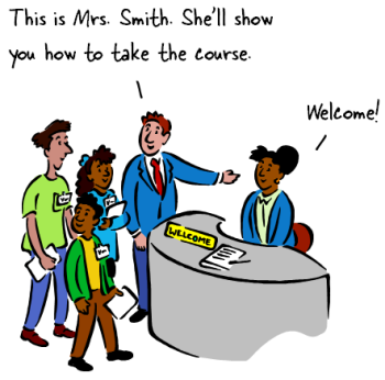
Many elearning courses have some sort of welcome screen or a start screen where you can review module choices and select where to go. They let you set the stage for your elearning course by selecting a few key images that fit the context of the course's content. And then use them to create a visually welcoming experience. Think of it like a welcome mat. The visual start screen is not going to replace good content. But it does set the tone and initial perception of the course. Use it to capture the person's attention and from there pull them into the course.
Fill In Your Design Gaps with Good Stock ImagesMost course developers aren't graphic designers. If you have a graphic designer, then you are set. But if you don't then you're on your own. So the challenge is how to get a nice look with limited experience and no resources. One of the easiest ways to make up for lack of graphic design is to find a few really strong images that fit the context of your course. Here's a good post on listening to your visual voice to figure out which images are the best fit.
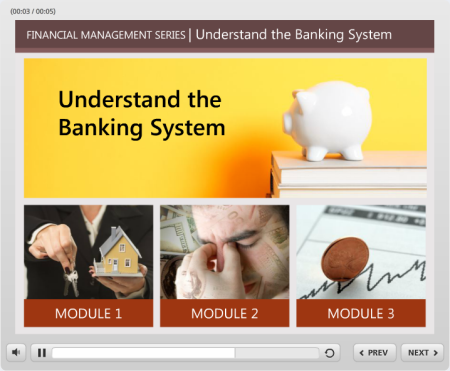
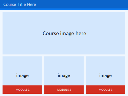
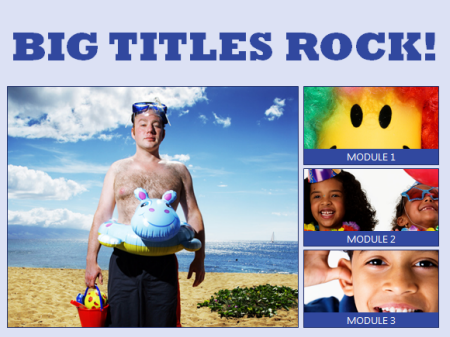
Create a Start Screen LayoutThere are a number of ways to design the layout. I like a strong title image and then add some compartment images. They can link to other sections or slides.
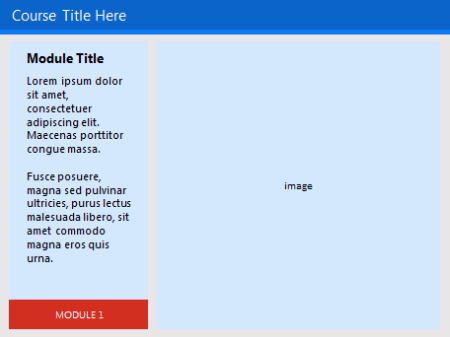
You may want to create an additional layout as the destination layout. This helps set some repetition and visual continuity.
The examples are basic. But you can create as many layouts as you want. They can be simple like the ones above or much more sophisticated. In an earlier post we discussed ways to determine layouts prior to building your course. I'd create some layouts similar to the ones above. Play around with the layouts. Make some horizontal and some vertical. And then maybe some that are more like a visual grid similar to what you'd see in Pinterest or on an iPad screen.
Add Images to the Start Screen LayoutOnce you have layouts determined, it's just a matter of adding the right images. As I stated earlier, I look for one image that sets the tone. It represents the essence of the module or section. It's kind of like the title font. Then I look for additional images to represent the segment topics.
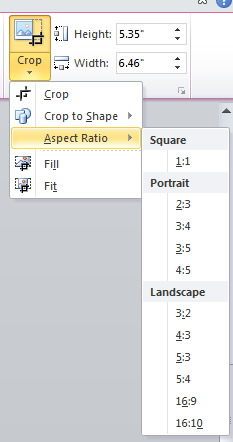
The key when working with the images is to use a consistent aspect ratio. You want all of the images to be the same and align properly. That will save you time. If you stick with a default aspect ratio, then you can crop to that aspect ratio and only worry about resizing the image.
To help you out, I created a quick tutorial of how to create a simple start screen layout and then show a simple way to crop the images to the layout so that the alignment is proper and consistent. Click here to view the tutorial. To save time or practice doing this, you can download the free template I used. The initial screen sets the tone of the course. What do you want that screen to look like? Is it inviting? or does it tell the learner that this is yet one more boring elearning course? Hopefully by starting with some pre-established layouts and the right images, you'll be able to capture the person's attention. Let me know what you think. Tidbits Looking forward to the San Francisco workshops. It's not too late to sign up. See the registration information below. I also added the Baton Rouge workshop info. If you love Storyline and want to add your voice to the Stevie Awards, then click this link and let your voice be heard. It's greatly appreciated! Vote For Us!
Upcoming events
Download your free 46-page ebook: The Insider's Guide to Becoming a Rapid E-Learning Pro |

| You are subscribed to email updates from The Rapid eLearning Blog To stop receiving these emails, you may unsubscribe now. | Email delivery powered by Google |
| Google Inc., 20 West Kinzie, Chicago IL USA 60610 | |
--
Posted By tremeex to tremeex at 7/23/2013 07:27:00 AM
--
Posted By tremeex to tremeex at 7/23/2013 07:27:00 AM
--
Posted By tremeex to tremeex at 7/23/2013 07:27:00 AM
--
Posted By tremeex to tremeex at 7/23/2013 07:27:00 AM
--
Posted By tremeex to tremeex at 7/23/2013 07:27:00 AM
--
Posted By tremeex to tremeex at 7/23/2013 07:27:00 AM
--
Posted By tremeex to tremeex at 7/23/2013 07:27:00 AM
--
Posted By tremeex to tremeex at 7/23/2013 07:27:00 AM
--
Posted By tremeex to tremeex at 7/23/2013 07:27:00 AM
--
Posted By tremeex to tremeex at 7/23/2013 07:27:00 AM
--
Posted By tremeex to tremeex at 7/23/2013 07:27:00 AM
--
Posted By tremeex to tremeex at 7/23/2013 07:27:00 AM
--
Posted By tremeex to tremeex at 7/23/2013 07:27:00 AM
--
Posted By tremeex to tremeex at 7/23/2013 07:27:00 AM
--
Posted By tremeex to tremeex at 7/23/2013 07:27:00 AM
--
Posted By tremeex to tremeex at 7/23/2013 07:27:00 AM
--
Posted By tremeex to tremeex at 7/23/2013 07:27:00 AM
--
Posted By tremeex to tremeex at 7/23/2013 07:27:00 AM
No comments:
Post a Comment