Here’s How to Build an E-Learning Template That Will Rock Your World |  |
| Here’s How to Build an E-Learning Template That Will Rock Your World Posted: 14 May 2013 12:30 AM PDT
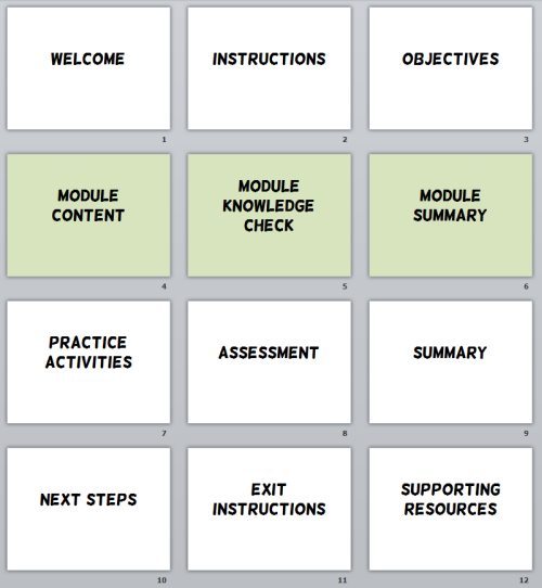
Okay, if an elearning template's going to rock your world you need to get out of your cubicle and go take a walk outside. Enjoy the life around you. Then come back and finish reading this blog post. I'll be waiting. Ready? Now that things are in perspective let's drop the hyperbole and look at what it takes to build the world's best elearning template. Create a Starter TemplateEarlier we looked at how to create an elearning template that works. In that post we discussed how to build a starter template for your online training courses by identifying the major parts or elements of an elearning course that are common to most courses. Then we create a placeholder slide for each part.
This serves two purposes. The first is that it becomes the framework for a course template. The other is that this starter template serves as a simple project guide. It helps those just getting started consider all of the major elements. Often some of these elements are an afterthought in the development process. By starting with a starter template, you ensure that all of the major parts of the course are considered. A key point here is that there is no graphic design or visual treatment to the screens. They're just blank placeholders to remind you that these common elements need to be considered during the production process. What Goes onto the E-Learning Course Screen?Unless you take a constructivist approach where the learner is expected to construct the course content from blank screens, odds are the screens in your course will have content on them. And when it comes down to it, there are really only so many things you can put on the screen. I like to keep it simple and group all of those things into two buckets—text and media.
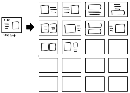
Where Can You Place Onscreen Elements?Considering those two onscreen elements, the next question is where can they be placed? There really are only so many ways you can layout your onscreen content. For example, body text, where can it go? Up, down, left, or right. The same goes for media. Where can you put the pictures on your screen? In some of our workshops we have people brainstorm different layouts. I keep it simple. Squiggly lines are text and boxes represent media. Then I create a bunch of boxes and play around with potential layouts as you can see in the example below.
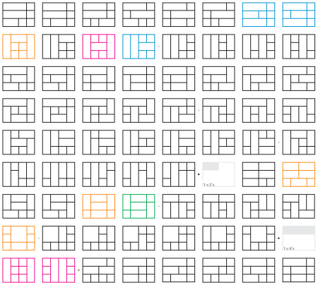
Dubberly Design Office has an interesting post where they show 892 unique ways to design a 4×3 screen. That's a lot of screens and should give you some ideas. I usually just look for about 15-20 or so to get started. Too many choices make it hard to move forward.
Create Common Screen LayoutsNow that you know what goes on the screen, the goal is to develop some layouts that you can use. In the exercise above you brainstormed a bunch of different layout ideas. Now you want to select a few for your starter template. Create a number of layouts that you can quickly use in your screen design. Of course you can create as many layouts as you'd like, but the goal isn't to create 5 million layouts. Instead it's to create a number of common starter layouts to go with your starter template. You want enough variety to keep it interesting and flexible, but not so many that it's a pain trying to work with them.
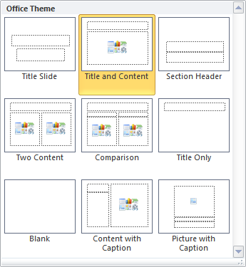
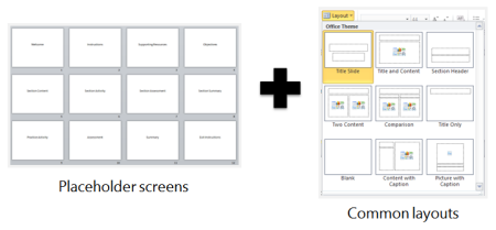
Once you've decided on the layouts, add them to your starter template. In PowerPoint and Storyline, you can add the layouts via the master slide template. That makes it really easy to select a starter slide and then apply a layout from one of the many prebuilt choices. When you're all done you should have a starter template with a number of content placeholder screens. And then within the template you have 20 or so good layouts that can be applied to any of the screens. That gives you a great place to start when building your rapid elearning courses.
And again as a reminder, there is still no look applied to the screens. So the visual design of your course is still open-ended. But what you've done is make sure that you have considered most of the common screens required in a course and have set up a number of usable layouts. This will speed up a lot of your production. Which screen layouts do you like best? Tidbits Looking forward to meeting many of the blog readers in London this week. If you're at the event, be sure to say hello. Also, be sure to check out the events in June. I'll be in Philadelphia, Florida, and Oregon.
Download your free 46-page ebook: The Insider's Guide to Becoming a Rapid E-Learning Pro |
| You are subscribed to email updates from The Rapid eLearning Blog To stop receiving these emails, you may unsubscribe now. | Email delivery powered by Google |
| Google Inc., 20 West Kinzie, Chicago IL USA 60610 | |
--
Posted By tremeex to tremeex at 5/14/2013 07:29:00 AM
--
Posted By tremeex to tremeex at 5/14/2013 07:29:00 AM
--
Posted By tremeex to tremeex at 5/14/2013 07:29:00 AM
--
Posted By tremeex to tremeex at 5/14/2013 07:29:00 AM
--
Posted By tremeex to tremeex at 5/14/2013 07:29:00 AM
--
Posted By tremeex to tremeex at 5/14/2013 07:29:00 AM
--
Posted By tremeex to tremeex at 5/14/2013 07:29:00 AM
--
Posted By tremeex to tremeex at 5/14/2013 07:29:00 AM
--
Posted By tremeex to tremeex at 5/14/2013 07:29:00 AM
--
Posted By tremeex to tremeex at 5/14/2013 07:29:00 AM
--
Posted By tremeex to tremeex at 5/14/2013 07:30:00 AM
--
Posted By tremeex to tremeex at 5/14/2013 07:32:00 AM
--
Posted By tremeex to tremeex at 5/14/2013 07:32:00 AM
--
Posted By tremeex to tremeex at 5/14/2013 07:32:00 AM
--
Posted By tremeex to tremeex at 5/14/2013 07:32:00 AM
--
Posted By tremeex to tremeex at 5/14/2013 07:32:00 AM
--
Posted By tremeex to tremeex at 5/14/2013 07:32:00 AM
--
Posted By tremeex to tremeex at 5/14/2013 07:32:00 AM
--
Posted By tremeex to tremeex at 5/14/2013 07:32:00 AM
--
Posted By tremeex to tremeex at 5/14/2013 07:32:00 AM
--
Posted By tremeex to tremeex at 5/14/2013 07:32:00 AM
--
Posted By tremeex to tremeex at 5/14/2013 07:32:00 AM
--
Posted By tremeex to tremeex at 5/14/2013 07:32:00 AM
--
Posted By tremeex to tremeex at 5/14/2013 07:32:00 AM
--
Posted By tremeex to tremeex at 5/14/2013 07:32:00 AM
--
Posted By tremeex to tremeex at 5/14/2013 07:34:00 AM
--
Posted By tremeex to tremeex at 5/14/2013 07:34:00 AM
--
Posted By tremeex to tremeex at 5/14/2013 07:34:00 AM
--
Posted By tremeex to tremeex at 5/14/2013 07:34:00 AM
--
Posted By tremeex to tremeex at 5/14/2013 07:34:00 AM

No comments:
Post a Comment