Three Common E-Learning Design Issues & How to Avoid Them |  |
| Three Common E-Learning Design Issues & How to Avoid Them Posted: 26 Feb 2013 12:18 AM PST
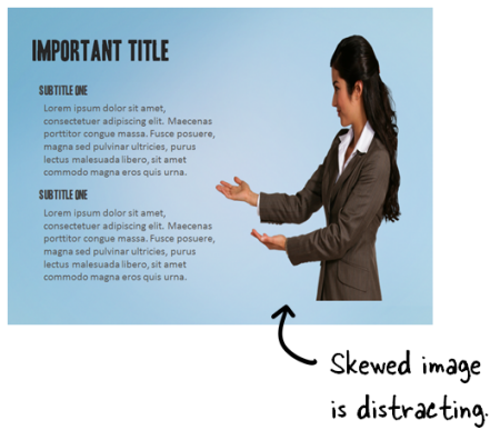
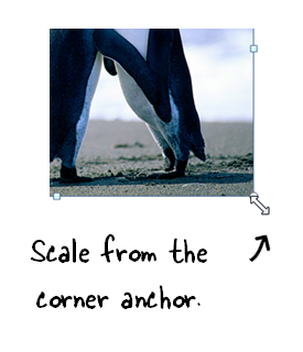
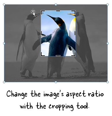
I review lots of elearning courses and demos. Since elearning is a mostly visual medium visual inconsistencies tend to stand out. They're the types of things that cause the Frankencourse design. I've been making a list of some of the more common issues that I find. So in today's post I'll highlight three that I see quite a bit and offer some feedback on how to avoid them. Images are SkewedImages on the screen are obviously not in the right dimension. They're usually stretched or flattened. This is probably the number one issue I see and easily fixed. The most common reason an image is skewed is because it's resized to fit a specific area or shape. To get it to fit, we use the anchors on the side or top and bottom to change the shape. What happens is that the shape is resized but doesn't maintain its aspect ratio. So it looks wrong.
Here are a couple of quick fixes:
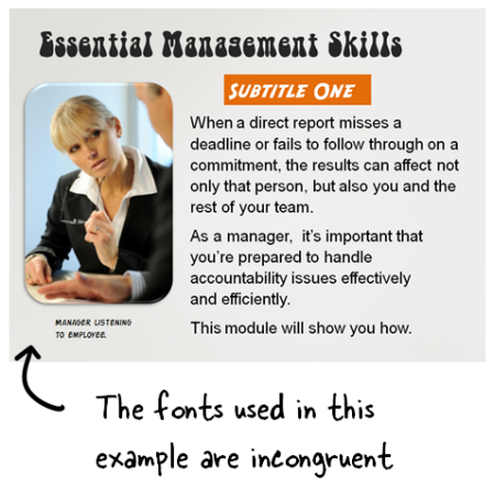
This also goes for shapes, especially circles. Many courses have numbered markers and I notice that a lot of circles become egg-shaped when scaled up or down. Font ConfusionMany courses tend to use too many fonts and without rhyme or reason. I usually tell people to limit the fonts they use to about seven. Just kidding! Often I'll see all sorts of whacky fonts plastered on the screen. When I ask why they chose a certain font it's usually because they wanted to make the course more interesting or engaging. That's a good goal. But an interesting font is not going to make your course interesting. And a poorly chosen font may even distract from it. Or just make it seem less polished.
As a general rule of thumb (especially for those just getting started) limit yourself to two or three fonts. Typically you need:
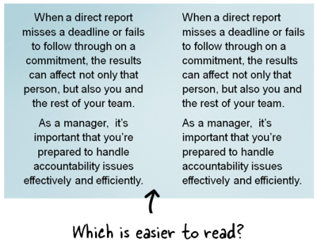
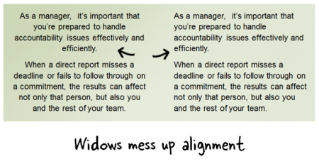
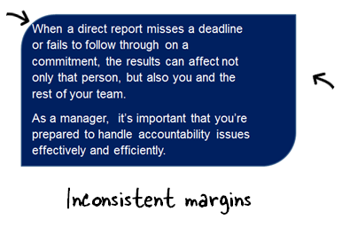
Being deliberate about your font choice and user fewer in your courses is an easy way to add consistency and polish to your elearning course. Here's a previous post on working with fonts which offers some ideas on which ones to select. Text Alignment IssuesText is the most common element on the screen. Obviously we use text to read and acquire information, but the text also is part of the course's visual design. Because of this, alignment is important. Here are three common issues I see regarding text:
You don't need to be a graphic designer to know when something doesn't look right. We may not always be able to explain why something doesn't look right, but we do know it when we see it. And that's the case with these little annoyances. If they don't exist no one notices. But when they do, things just don't look right. The good thing is that they are easily fixed and doing so will help your course have more polish. Tidbits Work with the Articulate community! There's a cool opportunity to be part of the Articulate community. You can learn more about the job here. What you'll need:
We won't start to look at the applications until after the Learning Solutions conference so that should give you plenty of time to put together samples of your best work. Upcoming workshops & locations for 2013:
Download your free 46-page ebook: The Insider's Guide to Becoming a Rapid E-Learning Pro |
| You are subscribed to email updates from The Rapid eLearning Blog To stop receiving these emails, you may unsubscribe now. | Email delivery powered by Google |
| Google Inc., 20 West Kinzie, Chicago IL USA 60610 | |
--
Posted By tremeex to tremeex at 2/26/2013 07:41:00 AM
--
Posted By tremeex to tremeex at 2/26/2013 07:41:00 AM
--
Posted By tremeex to tremeex at 2/26/2013 07:41:00 AM
--
Posted By tremeex to tremeex at 2/26/2013 07:41:00 AM
--
Posted By tremeex to tremeex at 2/26/2013 07:41:00 AM
--
Posted By tremeex to tremeex at 2/26/2013 07:41:00 AM
--
Posted By tremeex to tremeex at 2/26/2013 07:41:00 AM
--
Posted By tremeex to tremeex at 2/26/2013 07:41:00 AM
--
Posted By tremeex to tremeex at 2/26/2013 07:41:00 AM
--
Posted By tremeex to tremeex at 2/26/2013 07:41:00 AM
--
Posted By tremeex to tremeex at 2/26/2013 07:41:00 AM
--
Posted By tremeex to tremeex at 2/26/2013 07:41:00 AM
--
Posted By tremeex to tremeex at 2/26/2013 07:41:00 AM
--
Posted By tremeex to tremeex at 2/26/2013 07:42:00 AM
--
Posted By tremeex to tremeex at 2/26/2013 07:42:00 AM
--
Posted By tremeex to tremeex at 2/26/2013 07:42:00 AM
--
Posted By tremeex to tremeex at 2/26/2013 07:42:00 AM
--
Posted By tremeex to tremeex at 2/26/2013 07:42:00 AM
--
Posted By tremeex to tremeex at 2/26/2013 07:42:00 AM
--
Posted By tremeex to tremeex at 2/26/2013 07:42:00 AM
--
Posted By tremeex to tremeex at 2/26/2013 07:42:00 AM
--
Posted By tremeex to tremeex at 2/26/2013 07:42:00 AM
--
Posted By tremeex to tremeex at 2/26/2013 07:42:00 AM
--
Posted By tremeex to tremeex at 2/26/2013 07:42:00 AM


No comments:
Post a Comment