How Your Visual Voice Helps Build Better E-Learning |  |
| How Your Visual Voice Helps Build Better E-Learning Posted: 15 Jan 2013 12:03 AM PST
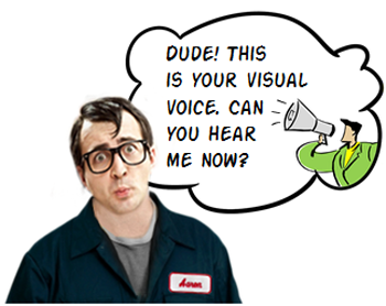
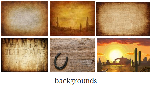
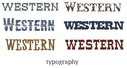
Having the right look for your elearning course can help engage the learner and set initial expectations because how your course looks tells the learner what to expect. There's a look that's right for your elearning course. It's just a matter of finding it. And that's when listening to your visual voice is critical. What is the Visual Voice?You may not be a trained graphic designer, but odds are that you can tell when things look right or not. That's because there's a voice in the back of your head that lets you know. At least there is in mine (but that could be the result of mental issues and/or beer). If I design a course for kids, I already have some preconceived ideas of what look is appropriate for that audience. Most likely I'll stick with primary colors and the characters may be a bit cartoony. Each one of us has a visual voice that we can hear and learn to build better looking elearning courses. The secret is learning to hear the voice. E-Learning Workshop ExampleHere's an exercise we do at the workshop. Suppose you're hired to develop a western movie poster.
In most cases, people tend to agree on the colors and general look of the poster. It has that dusty brown look with cactus and tumbleweeds. As far as the font, they may not know the name but they know the right font when they see it. And of course the people in the poster would look like cowboys. In addition, there'd be all sorts of design elements that have a western context (like wanted posters, horses, lassos, etc.).
While we may not agree on all of the details, we'd probably come up with something very similar. And that's because we have a visual voice that tells us what a western movie poster should be. If it doesn't look like right, it throws off our expectations. Suppose you were going to do a Mafia movie poster. What colors would you use? Most likely you'd use black, white, and red. Sure enough! If you do a search, you'll see that most Mafia movie posters use those colors. But, if the colors (and fonts) were different you'd probably change your expectations of what the Mafia movie was about. In the example below the fonts and background are changed. How does that change your perception of the movie?
The Visual Voice for E-LearningThese principles work the same for an elearning course. Posters aren't that much different than the screens in your elearning courses. The design elements are generally the same. You'll use colors, a background, characters and text. Here's an exercise for you. Suppose you are going to build a safety course. What colors come to mind? Which fonts? What types of characters? What would they wear? What design elements do you recognize as safety-related? Now, let's switch the course topics and suppose you're building a course on handling customer calls in a call center. How would the look of the course be different than the safety course? Why? There are number of ways to tap into your visual voice. Here are four things I try to expose:
They key is that your elearning course is going to look like something. The secret is figuring out what that something is. Tapping into your visual voice helps you figure it out. And from there you'll be able to set the initial expectations and engage the learner. And this is one of the first steps in creating effective elearning. Tidbits Here's a list of upcoming workshops. If you're interested in seeing one in your area, have your local ISPI or ASTD chapter contact me.
Download your free 46-page ebook: The Insider's Guide to Becoming a Rapid E-Learning Pro |
| You are subscribed to email updates from The Rapid eLearning Blog To stop receiving these emails, you may unsubscribe now. | Email delivery powered by Google |
| Google Inc., 20 West Kinzie, Chicago IL USA 60610 | |
--
Posted By tremeex to tremeex at 1/15/2013 07:42:00 AM
--
Posted By tremeex to tremeex at 1/15/2013 07:42:00 AM
--
Posted By tremeex to tremeex at 1/15/2013 07:42:00 AM
--
Posted By tremeex to tremeex at 1/15/2013 07:42:00 AM
--
Posted By tremeex to tremeex at 1/15/2013 07:42:00 AM
--
Posted By tremeex to tremeex at 1/15/2013 07:42:00 AM
--
Posted By tremeex to tremeex at 1/15/2013 07:42:00 AM
--
Posted By tremeex to tremeex at 1/15/2013 07:42:00 AM
--
Posted By tremeex to tremeex at 1/15/2013 07:42:00 AM
--
Posted By tremeex to tremeex at 1/15/2013 07:43:00 AM
--
Posted By tremeex to tremeex at 1/15/2013 07:43:00 AM
--
Posted By tremeex to tremeex at 1/15/2013 07:43:00 AM
--
Posted By tremeex to tremeex at 1/15/2013 07:43:00 AM
--
Posted By tremeex to tremeex at 1/15/2013 07:43:00 AM
--
Posted By tremeex to tremeex at 1/15/2013 07:43:00 AM
--
Posted By tremeex to tremeex at 1/15/2013 07:43:00 AM
--
Posted By tremeex to tremeex at 1/15/2013 07:43:00 AM
--
Posted By tremeex to tremeex at 1/15/2013 07:43:00 AM
--
Posted By tremeex to tremeex at 1/15/2013 07:43:00 AM
--
Posted By tremeex to tremeex at 1/15/2013 07:43:00 AM
--
Posted By tremeex to tremeex at 1/15/2013 07:43:00 AM
--
Posted By tremeex to tremeex at 1/15/2013 07:43:00 AM
--
Posted By tremeex to tremeex at 1/15/2013 07:43:00 AM
--
Posted By tremeex to tremeex at 1/15/2013 07:43:00 AM
--
Posted By tremeex to tremeex at 1/15/2013 07:43:00 AM
--
Posted By tremeex to tremeex at 1/15/2013 07:43:00 AM
--
Posted By tremeex to tremeex at 1/15/2013 07:43:00 AM
--
Posted By tremeex to tremeex at 1/15/2013 07:43:00 AM
--
Posted By tremeex to tremeex at 1/15/2013 07:43:00 AM
--
Posted By tremeex to tremeex at 1/15/2013 07:43:00 AM
--
Posted By tremeex to tremeex at 1/15/2013 07:43:00 AM
--
Posted By tremeex to tremeex at 1/15/2013 07:43:00 AM
--
Posted By tremeex to tremeex at 1/15/2013 07:43:00 AM
--
Posted By tremeex to tremeex at 1/15/2013 07:43:00 AM
--
Posted By tremeex to tremeex at 1/15/2013 07:43:00 AM
--
Posted By tremeex to tremeex at 1/15/2013 07:43:00 AM
--
Posted By tremeex to tremeex at 1/15/2013 07:43:00 AM


No comments:
Post a Comment