How to Create an Interactive PowerPoint Elearning Module |  |
| How to Create an Interactive PowerPoint Elearning Module Posted: 11 Sep 2012 12:30 AM PDT
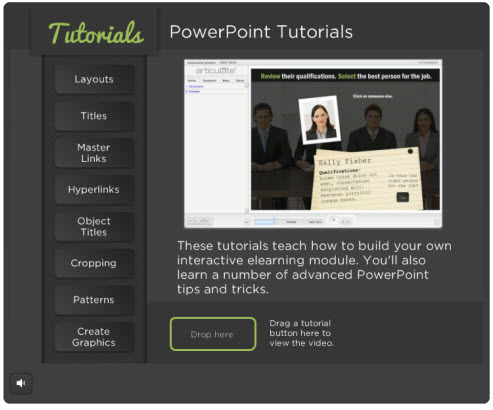
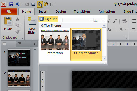
In a recent post we looked at ways to build interactive elearning even if using PowerPoint to build the courses. One of the demos I shared prompted lots of questions. So in today's post I'll show you how I created the PowerPoint interaction. This lets us look at some essential production tips when using PowerPoint to build interactive elearning. PowerPoint TutorialsClick here to view the tutorials. Review the PowerPoint interaction to see how it works. I also included a link to download the PowerPoint file so that you can see how it's assembled. This may help when viewing the tutorials above. Or quickly skim the notes below. In addition, the download can be used as a template. Feel free to replace the content with your own if you need a quick interactive module. Use Multiple LayoutsUse as many layouts as you need to build your course. In this template I have two layouts. One layout is for the instructions and feedback; and the other layout for the interaction.
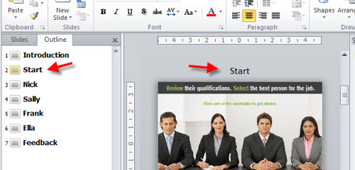
As a rule of thumb, once I get three or more slides with the same information, I try to put as much as I can on the master slide so it's easier to edit and maintain. When you build your slides, try to determine what's persistent and then add as much of the persistent content to the master slide. Use Slide Titles as MetadataI like to move the titles in the master slide up and off the slide. This lets me use the title area as a way to describe the slide, but not have that content appear in the actual slide.
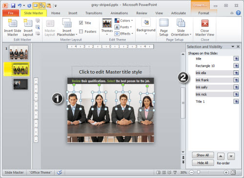
This comes in really handy when you're creating interactive branches and using PowerPoint's hyperlinking because the titles of the slide are easy see. Don't be afraid to add a lot of descriptive content to the slide title. Add Hyperlinks to the Master SlideIn this interaction, we're working with a single image that has multiple hyperlinks. Since we're using the same master slide for all five slides, it makes sense to add the hyperlink to the master slide. That means I only add them once and they're easy to edit.
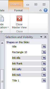
Create Shapes for HyperlinksYou can add a hyperlink to any object in PowerPoint. However, if you look at the object on the slide, there's no way of knowing which ones have links or not. Come back to a course three weeks later and you'll have to spend a lot of time trying to remember which objects have links and where they go.
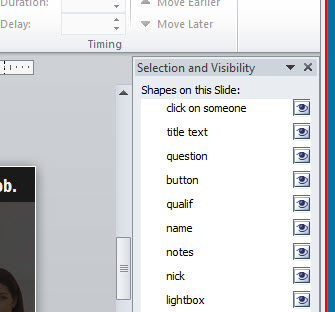
That's why I like to create a shape just for the links. I add the link to the shape and then in the selection pane I title the shape as a link and where it goes. This makes reviewing the slide's links super easy. Bonus tip: CTRL+K opens the hyperlink window. Title Objects on the SlideIn the image above I show an example of titled hyperlinks. And in the image below I show titled objects on the slide. It's a good habit to title objects on the slide. The most obvious reason is that you know what each object is and what it does based on how you title it.
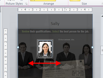
The other reason is that when you leave the course and come back a while later, you'll find it a lot easier to orient yourself to what's there. That's a big time saver, especially if you hand the course off to someone else to maintain. The Cropping Tool is Your FriendIn this template, I added the image of the four people on the master slide. I created a new slide and applied the master layout. Then I pasted a copy of the image on the slide itself. From there I was able to use the crop feature to crop to the person's head and add the image frame.
I duplicated the first slide for each additional character. Then selected the head image (see above) and opened the cropping tool. All I had to do was move the crop box to the new head and all of the same formatting was applied. Graphic Creation TipsOne of the best parts of PowerPoint is that you can create your own graphics by combining the shape formatting with layered objects.
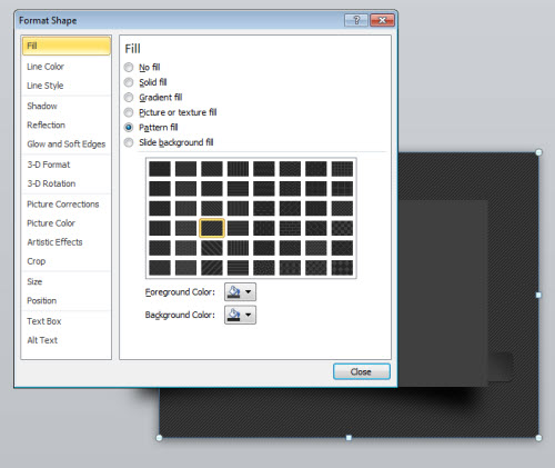
I created a pattern background for the slide to add a little depth and visual interest. Instead of adding it to the background, I put a shape on the slide then applied the pattern fill to the shape. This gives me the flexibility to manipulate the background.
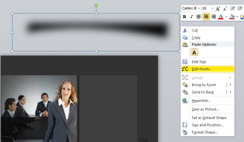
The drop shadow under the box is a rectangle that is semitransparent and uses a soft edge. Use the edit points to create a pull away shadow for more depth. Here's a tutorial that shows how to create that type of shadow.
Layer images for more effect. In this example, I started with an office image. To make it more interesting, I pulled the woman out of the image and added a lighting effect in the corner. I also added a shape to use as a text box. In the case of the woman in front of the table, I start with the original image of the woman in the meeting room at the desk (1). Then I added a spotlight shape on top of the original image to create a corner shadow (2). I added the semitransparent rectangle as a content holder for my title text (3). Finally, I duplicated the image and isolated the woman by cutting out the background. Then I added the isolated woman back on top of the image. This pulls her out of the original image and puts her on top of the text box. This is a simple technique that helps create a focal point. As you can see PowerPoint's freeform environment makes it easy to create your own graphic effects. Even if you don't build the same type of interaction in PowerPoint, these production tips are generally the same ones you use to build any interactive elearning courses in PowerPoint. Tidbits: I'm planning my schedule for next year. If you're interested in a workshop in your area, have your local ISPI or ASTD chapter contact me.
Download your free 46-page ebook: The Insider's Guide to Becoming a Rapid E-Learning Pro |
| You are subscribed to email updates from The Rapid eLearning Blog To stop receiving these emails, you may unsubscribe now. | Email delivery powered by Google |
| Google Inc., 20 West Kinzie, Chicago IL USA 60610 | |
--
Posted By tremeex to tremeex at 9/11/2012 07:41:00 AM
--
Posted By tremeex to tremeex at 9/11/2012 07:42:00 AM
--
Posted By tremeex to tremeex at 9/11/2012 07:42:00 AM
--
Posted By tremeex to tremeex at 9/11/2012 07:42:00 AM
--
Posted By tremeex to tremeex at 9/11/2012 07:42:00 AM
--
Posted By tremeex to tremeex at 9/11/2012 07:42:00 AM
--
Posted By tremeex to tremeex at 9/11/2012 07:42:00 AM
--
Posted By tremeex to tremeex at 9/11/2012 07:42:00 AM
--
Posted By tremeex to tremeex at 9/11/2012 07:42:00 AM
--
Posted By tremeex to tremeex at 9/11/2012 07:42:00 AM
--
Posted By tremeex to tremeex at 9/11/2012 07:42:00 AM
--
Posted By tremeex to tremeex at 9/11/2012 07:42:00 AM
--
Posted By tremeex to tremeex at 9/11/2012 07:42:00 AM
--
Posted By tremeex to tremeex at 9/11/2012 07:42:00 AM
--
Posted By tremeex to tremeex at 9/11/2012 07:42:00 AM
--
Posted By tremeex to tremeex at 9/11/2012 07:42:00 AM
--
Posted By tremeex to tremeex at 9/11/2012 07:42:00 AM
--
Posted By tremeex to tremeex at 9/11/2012 07:42:00 AM
--
Posted By tremeex to tremeex at 9/11/2012 07:42:00 AM
--
Posted By tremeex to tremeex at 9/11/2012 07:42:00 AM
--
Posted By tremeex to tremeex at 9/11/2012 07:42:00 AM
--
Posted By tremeex to tremeex at 9/11/2012 07:42:00 AM
--
Posted By tremeex to tremeex at 9/11/2012 07:42:00 AM
--
Posted By tremeex to tremeex at 9/11/2012 07:42:00 AM
--
Posted By tremeex to tremeex at 9/11/2012 07:42:00 AM
--
Posted By tremeex to tremeex at 9/11/2012 07:42:00 AM
--
Posted By tremeex to tremeex at 9/11/2012 07:42:00 AM
--
Posted By tremeex to tremeex at 9/11/2012 07:42:00 AM
--
Posted By tremeex to tremeex at 9/11/2012 07:42:00 AM
--
Posted By tremeex to tremeex at 9/11/2012 07:42:00 AM
--
Posted By tremeex to tremeex at 9/11/2012 07:42:00 AM
--
Posted By tremeex to tremeex at 9/11/2012 07:42:00 AM
--
Posted By tremeex to tremeex at 9/11/2012 07:42:00 AM



No comments:
Post a Comment